
Trends in web design move faster than in almost any other kind of media, in part due to advancement in the underlying technology, but also the huge range of devices used for browsing on which means it’s essential that a website looks good.
While a ‘following the crowd’ mentality isn’t always best, it has to be said that a lot of the current trends are borne from the desire to make websites intuitive and more interesting to use. This involves using some level of familiarity, especially with navigation.
The attention span of online users is incredibly short. A study has shown that a website’s visual appeal can be assessed within 50ms (that’s a scary 0.05 seconds!) That’s the total time your website has in which to encourage visitors to stay or leave. 0.05 seconds…
Material Design
One of the most noticeable shifts in web design over the last decade has been from Skeuomorphism to Flat Design. Skeuomorphism, championed by Apple in 2007, includes the use of drop shadows and textures to make elements on screen look like their real-world counterparts, for instance, a leather-bound calendar with stitching.
Flat Design, the polar opposite to skeuomorphism, traces its roots back to the ‘Swiss Style’ of graphic design championed by Bauhaus in the 1950s and 1960s. It’s much more focused on hierarchy of content, minimalism and the reduction of unnecessary elements such as gradients, drop shadows and texture, with Microsoft’s Metro and Apple’s IOS7 (released in 2013) being well-known early examples.
Material Design is a variation of the Flat Design style, promoted by Google in their early 2015 branding guidelines. It includes the use of grid-based layouts, responsive animations and an element of depth, produced with the careful use of drop-shadows and lighting sources. One of its advantages is that it’s more obvious to the user which elements are meant for interaction – such as buttons and menus.
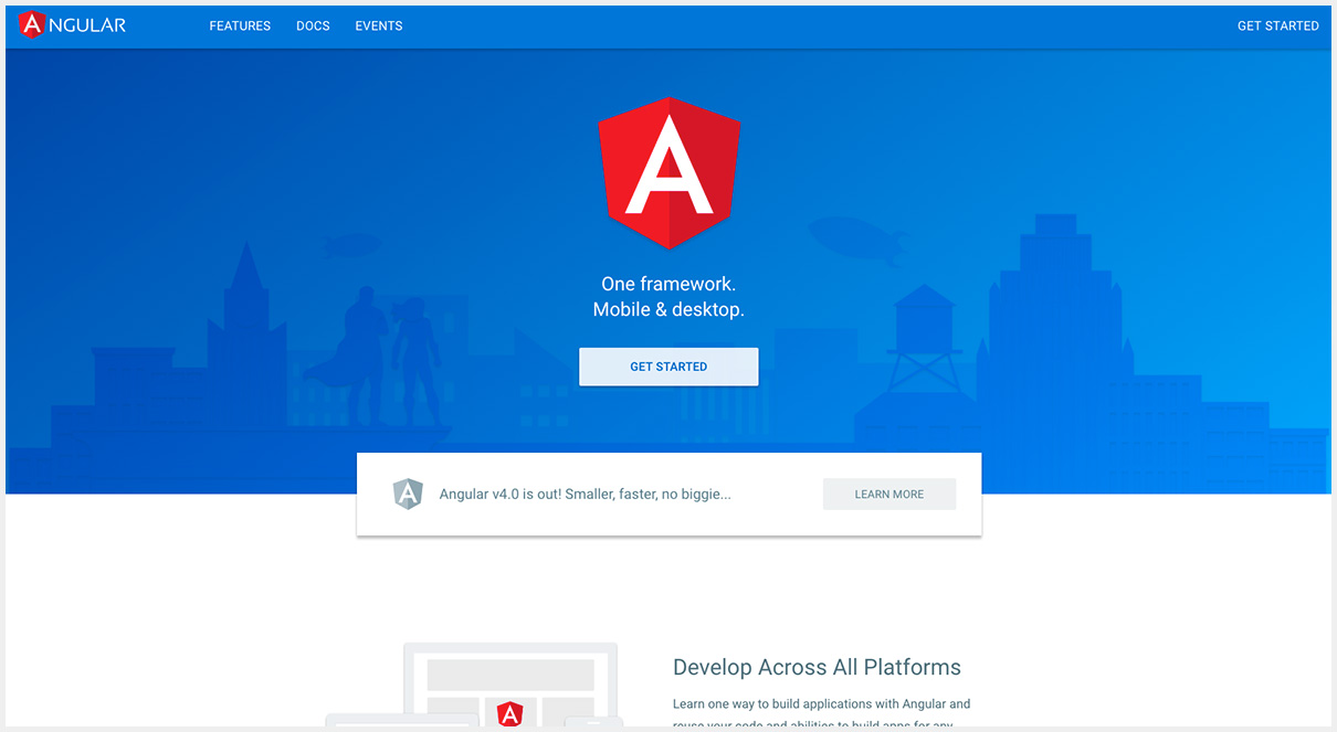
Image courtesy of:
https://angular.io/
Streamlined Colour Palettes
As Flat Design became more popular, colour palettes were expanded to include as many as five bright hues. Now we are seeing websites scaling back to one or two colours (not including neutrals like black, white and grey.) This requires the careful use of design hierarchy to make important elements stand out.
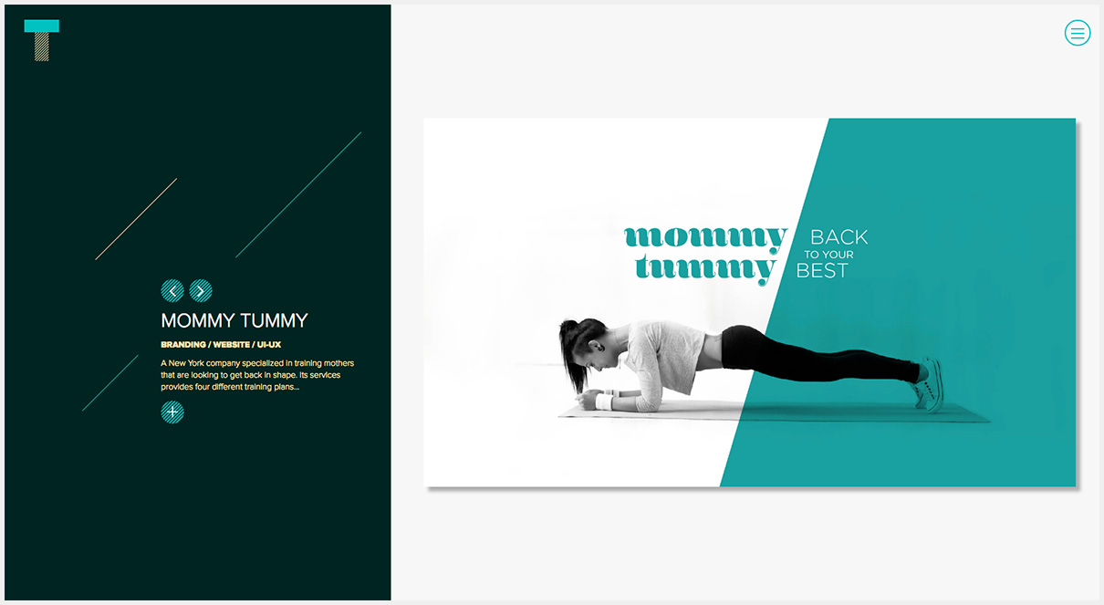
Image courtesy of:
http://tramastudio.net/
More Room on the First Screen or ‘Hero Area’
The hero area is the first part of a website page that users will see. In previous years, designers would try to cram in as much information as possible ‘above the fold’ – a print term which refers to the material someone would see first in a folded newspaper. It led to cluttered layouts which didn’t convert well as users didn’t know where to begin. There’s a lot of research to support the fact that website users scroll instinctively. As such, the hero area can be used to represent the main point of the website in a visual way, often including full-screen images or video content. The rest of the homepage content can fit into a hierarchy beneath it.
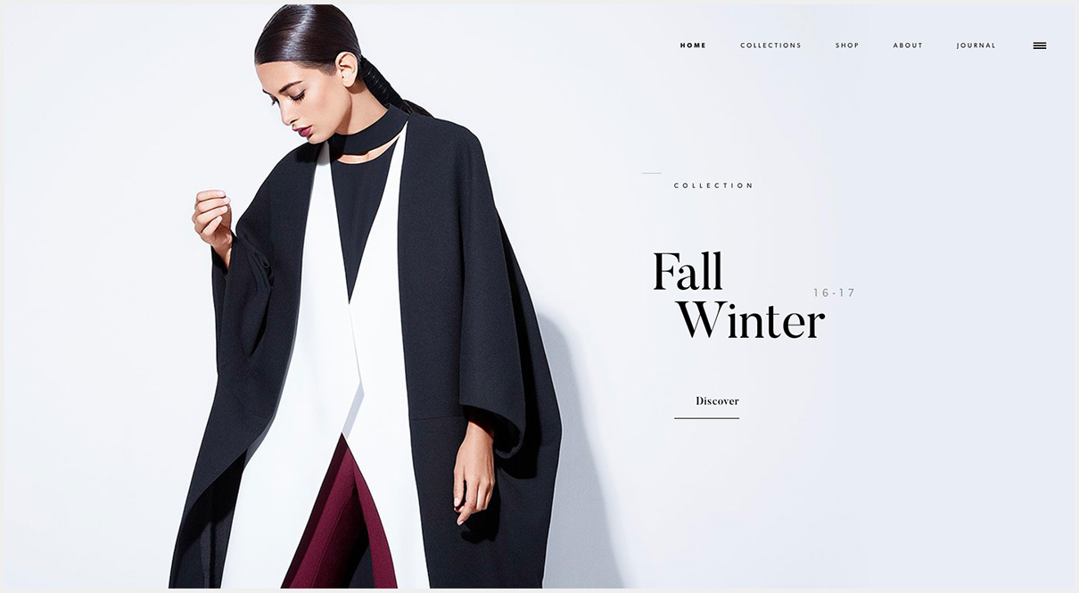
Image courtesy of:
https://bouguessa.com/
Split Screen Homepages
How do you use the hero area effectively if the website is trying to reach more than one audience at a time? A recent solution has been to split the homepage into two distinct halves – giving each the same hierarchy and offering the users two avenues to explore.
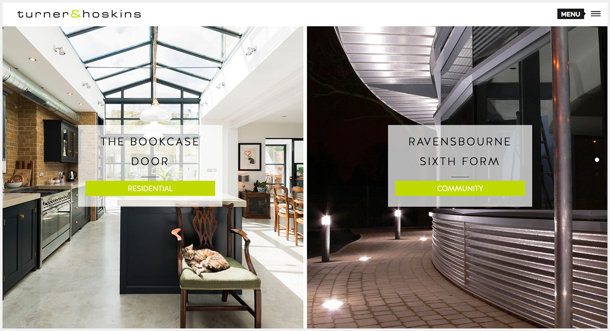
Image courtesy of:
http://www.turnerandhoskins.co.uk
Hidden Menus
The ‘burger menu’ originated in mobile website and app design. I’m sure you will have noticed three lines in the corner of a screen which indicate that a collapsible menu is available. While this results in a very uncluttered website header, use should be carefully considered since the navigation options are always hidden until a user opens the menu by clicking on the icon.
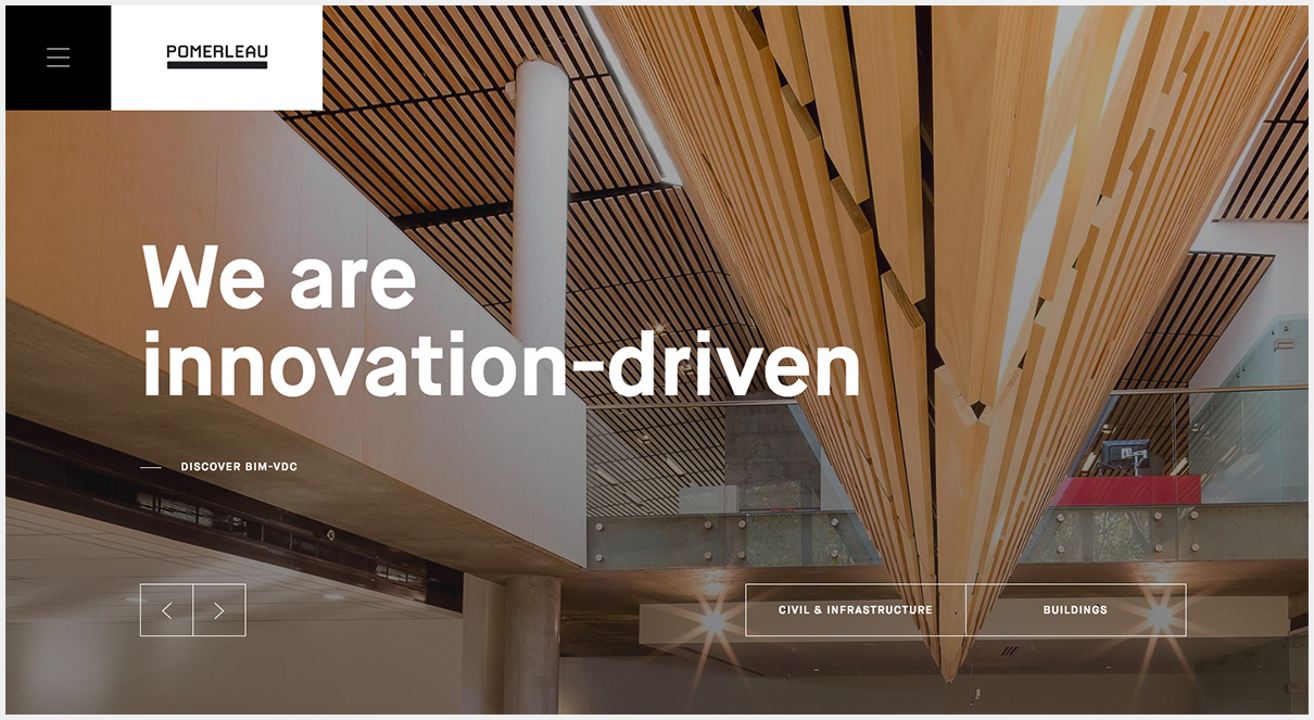
Image courtesy of:
http://pomerleau.ca/
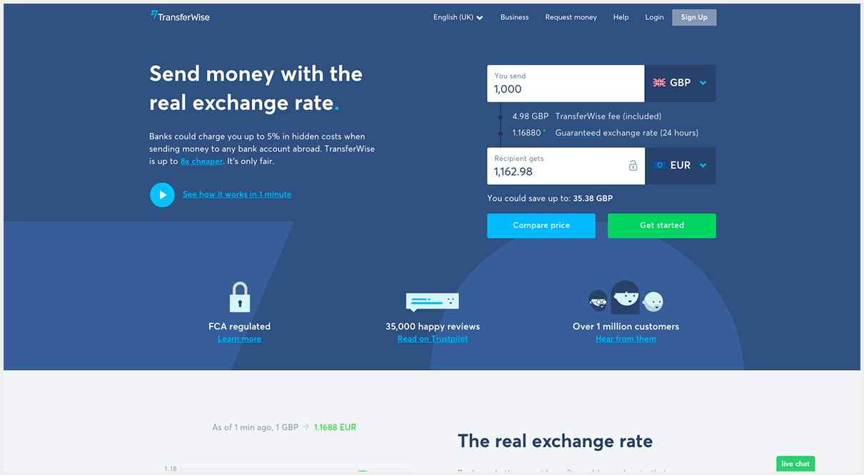
Iconography
Icon design – the pictorial representation of a statement or action – isn’t a new concept. However, recent popularity on the user interfaces of apps and smart devices has led to increased use on the web. Most users will initially scan a web page for visually interesting content and will only stop if something grabs their attention. The use of oversized icons is a good way to get them into the content of your site. They can also help simplify complex concepts, which gives a website the impression of being easy to use.
Image courtesy of:
https://transferwise.com
So Why Does This Matter?
In our media-saturated world, users are accustomed to seeing the cutting-edge websites produced by big brands with big budgets. Consequently, they’re often more used to modern design trends than they realise and will subconsciously judge other websites by the same standards.
The average company website, no matter how well designed, has a lifespan of two to three years before it will start to look dated. For this reason, it’s a good idea to keep up with the trends and be on the lookout for opportunities to convey your brand in a modern and interesting way.

Shaun McElvaine
With an eye for detail and a passion for modern, minimalist and functional design, Shaun McElvaine has worked for a range of clients from startups to large corporates.
Email: shaun@magnifycreative.co.uk